case study
Design the booking process of the FlyPH website
The single biggest use case of any airline website is their booking process. A large number of visits and transactions made go throught this process therefore it is very important it offers a smooth and easy experience for any user. This project involves identifying ways to improve the user experience when booking flights.
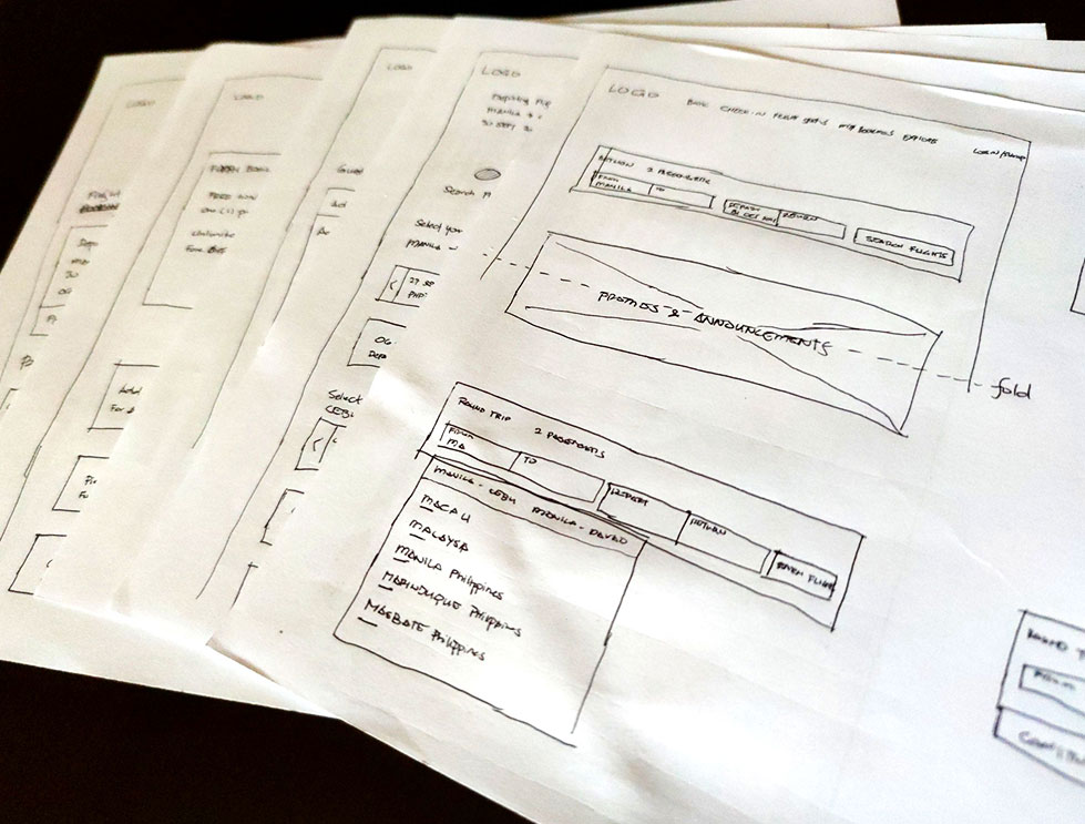
Goal - Research insights in the booking process and use the data to create wireframes for FlyPH's booking process
Profile - FlyPH is a startup airline creating its first company website
Scope - Use the booking process as the sole use case
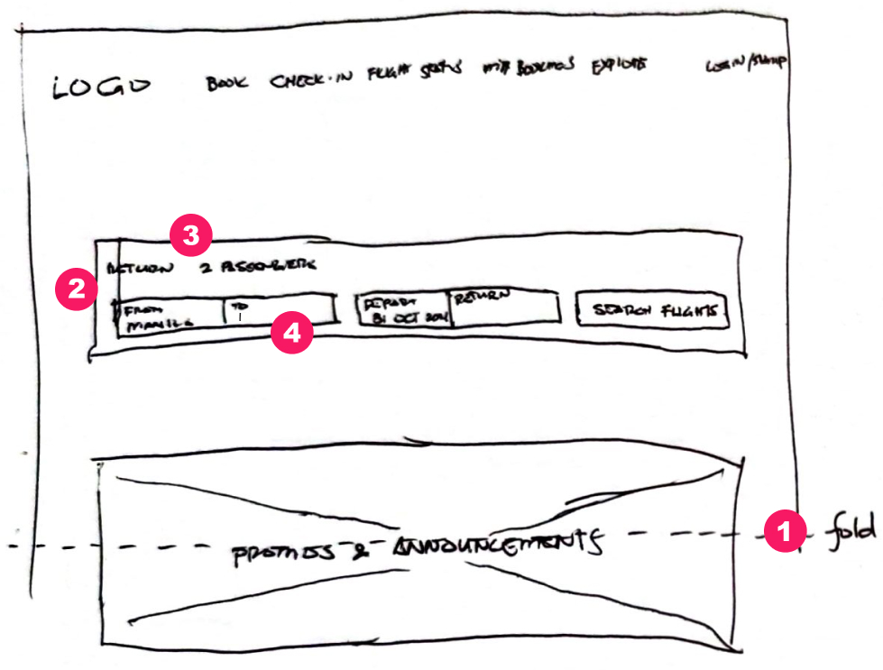
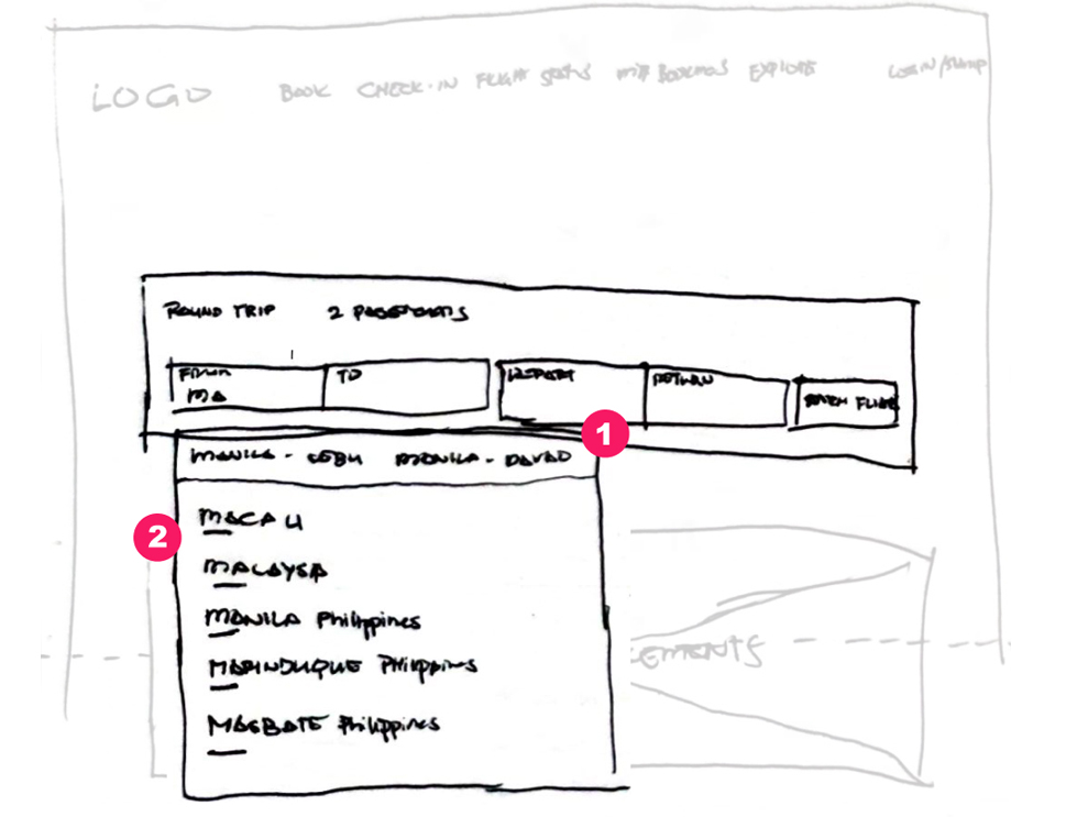
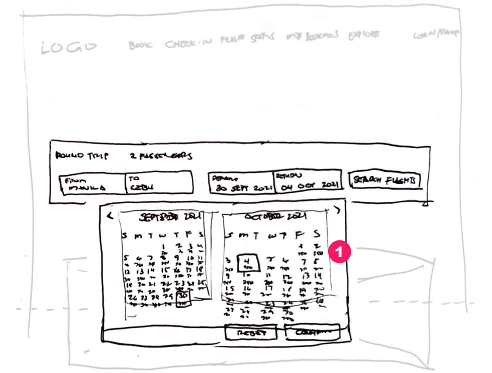
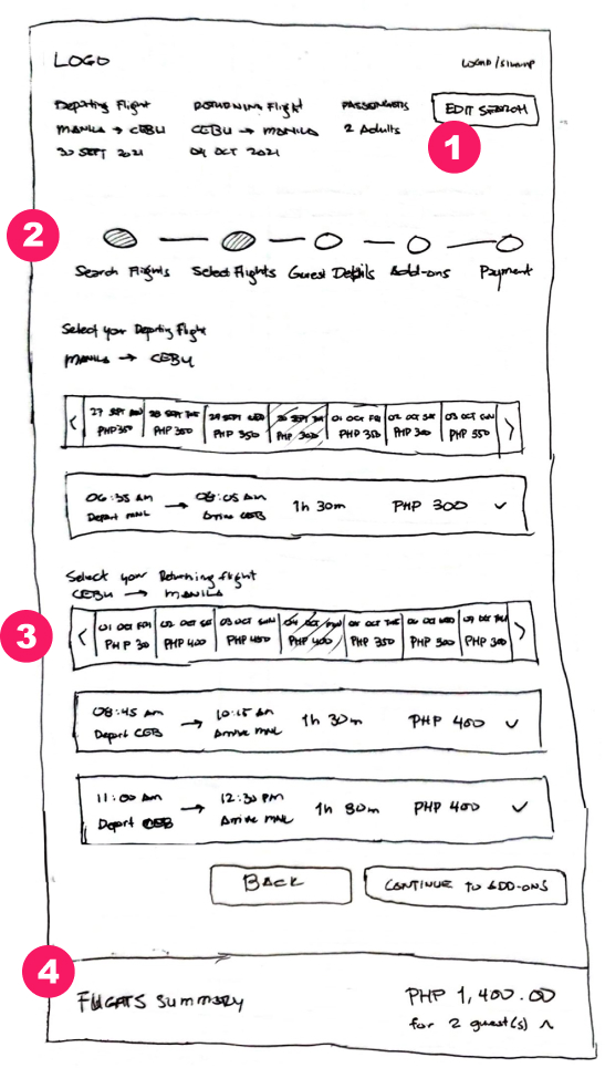
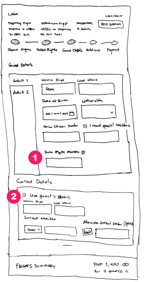
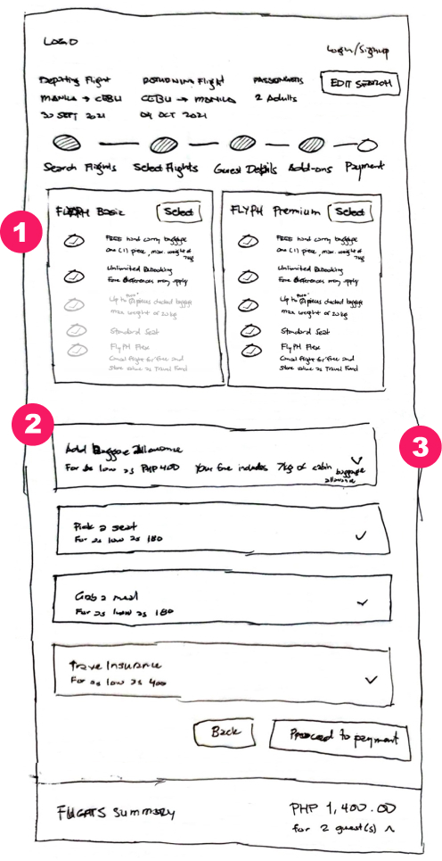
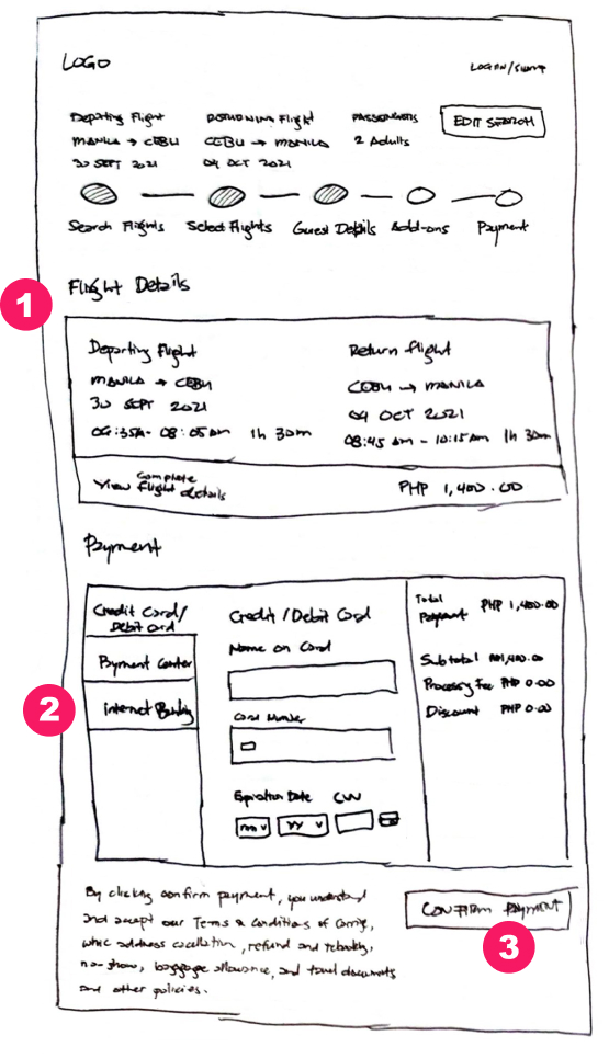
Design Output - Design wireframes that the UI designers and developers can use
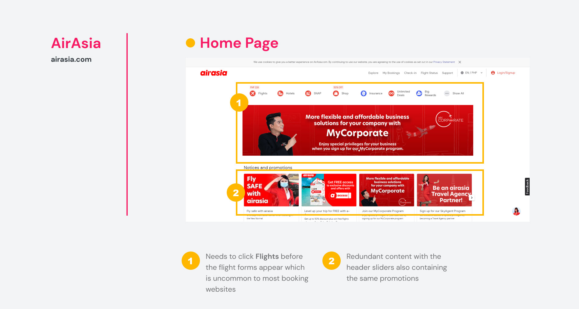
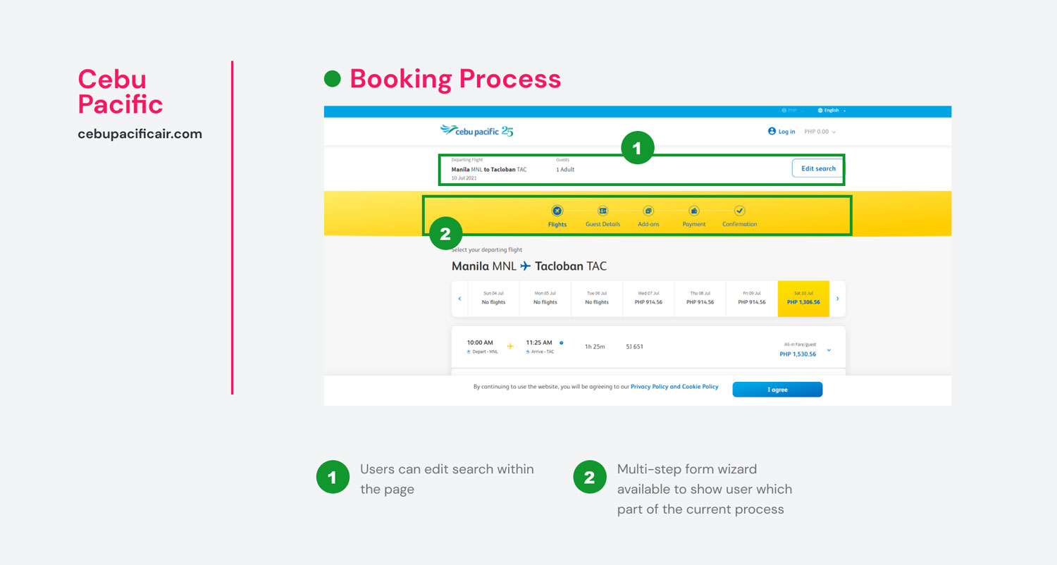
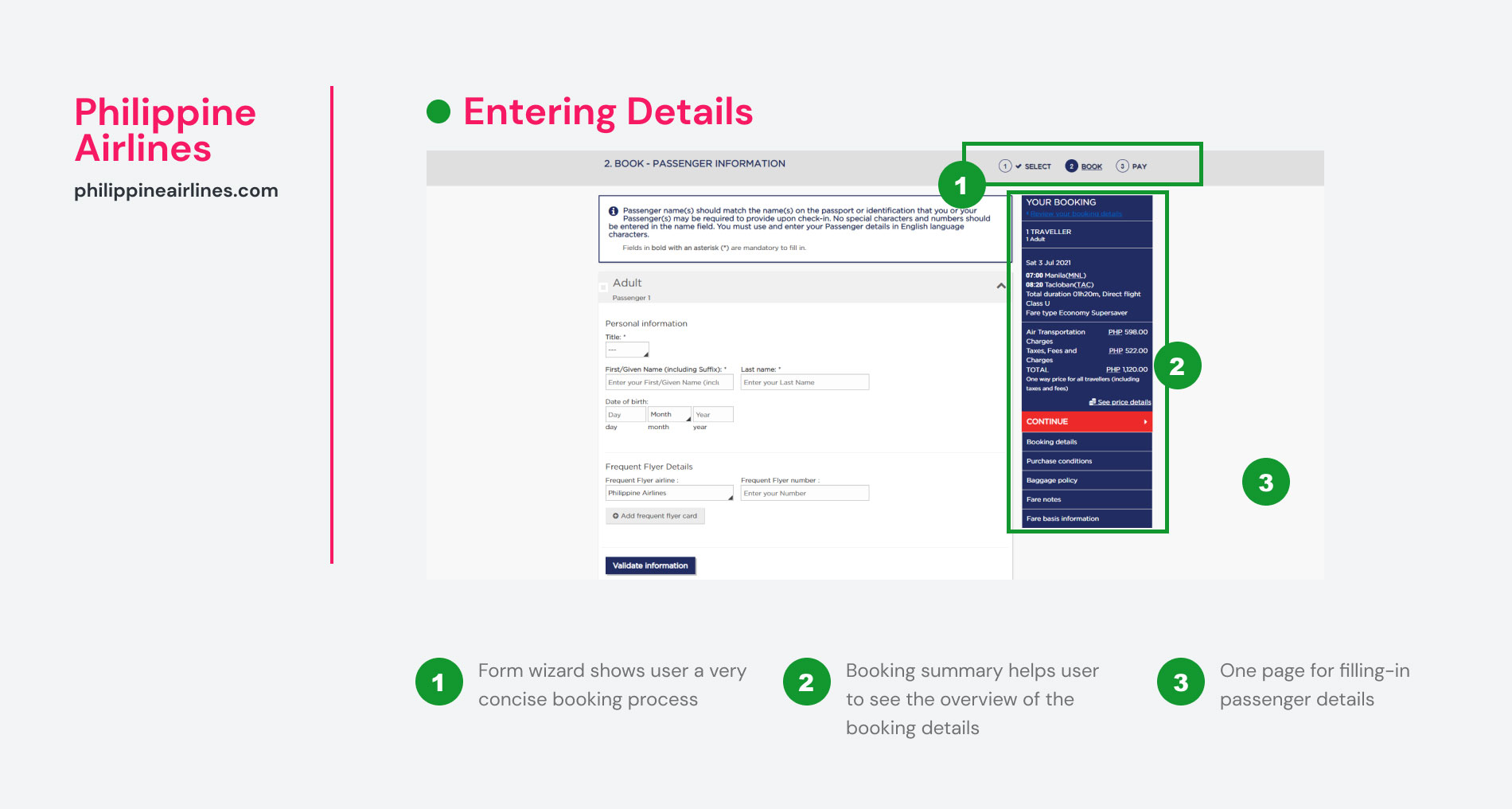
I looked into the websites of the major players in the Philippine airline industry. Their websites provide insights on how they solve their booking problems, understand the design conventions, and emulate the best practices done by these companies.
To simulate the booking process, I reviewed the homepage until the payment page. This exercise revealed that the three companies have almost had the same processes with the differences evident in just design layout and site features. The identical processes is an advantage because it helps users to familiarize themselves with the booking interface. This also helps FlyPH to have a reference when designing their own interface.
user survey
what did you do when you visited the airline website/app?
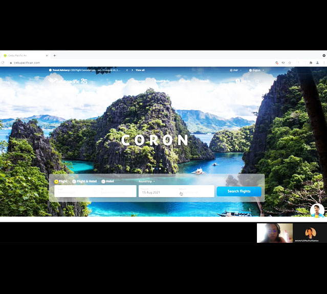
To learn about the websites' context of use, a usability test was conducted. The test demonstrates the goals and behaviours of customers when booking flights. I interviewed a couple of users of different backgrounds for this test.
An important insight in the interviews showed that a good amount of users are already successfully booking their flights but user experience design greatly affects if it was a bad, good, or great transaction. Therefore it's essential to create a smooth and easy booking experience.
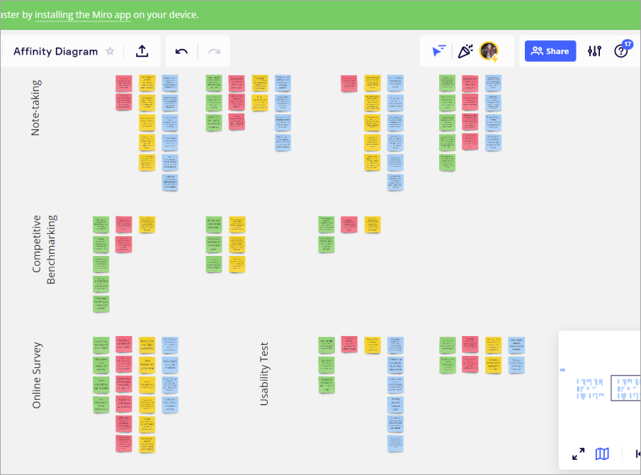
The process of creating the diagram starts with the gathering of data from the previous projects. Those projects include competitive benchmarking, user survey, and usability tests . All notes from the project was compiled and written in Miro notes. Each note was written in a corresponding color based on a particular user experience.
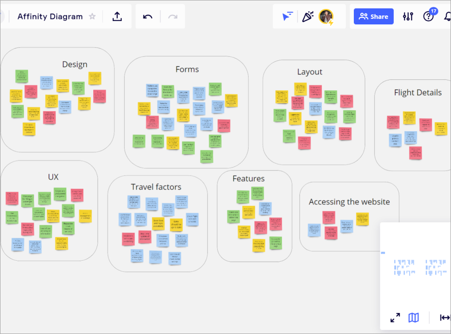
The next step involves studying the Miro notes and sorting them into groups under a similar theme. Continued think work is done until definite groups starts to evolve. These groups will serve as an essential guide that needs to be addressed during the website redesign process.
After sorting the Miro notes, it resulted in its final 12 groupings. You can view the Miro board link to see the data.
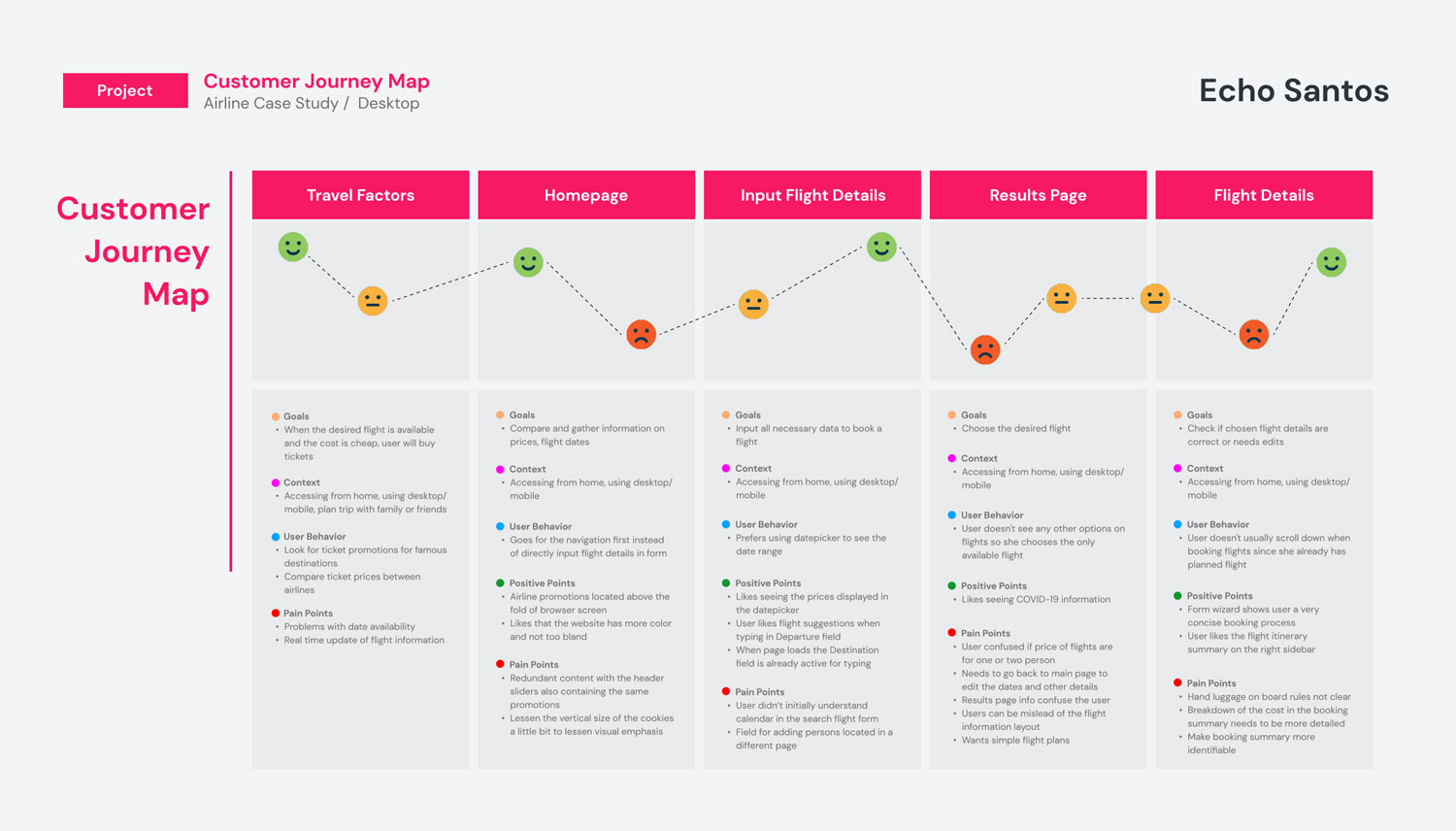
Building on the work I did in the affinity diagram, I added more more structure on the analysis of my research data by creating a customer journey map. The customer journey map is used to define the high-level steps in the user's journey.